Brand kit
A toran across
the shop front.
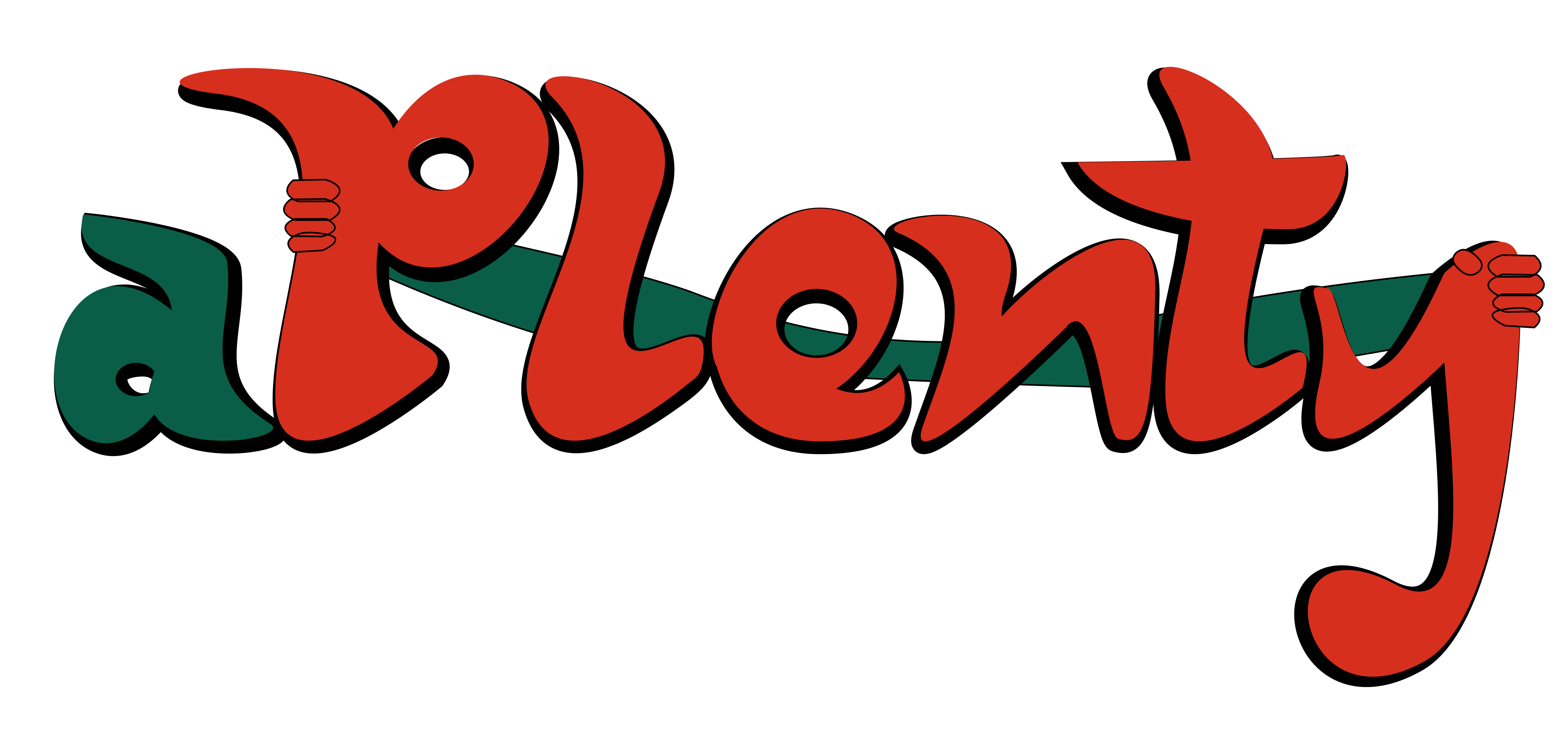
Aplenty is India’s live marketplace. On opening day an Indian shop strings a garland across its front. That is the logo: a big red “Plenty”, a green rope strung behind it, and two red fists hugging the P and the y — the letters are the arms holding it all together.
The logo
Drawn in Photoshop, converted to vectors without redrawing, so the master file stays the source of truth.
The word
Written as aPlenty — a small, plain “a” and a big, swinging “Plenty”. It reads as the phrase “a plenty”, and the weight lands on the word that makes the promise.
The rope
A green rope strung behind the word, the way a garland is threaded across a shop front. It ties every letter into one object: everything we have, held together.
The fists
One at each end, clutching the P on the left and the y on the right. The two letters are the arms, and the fists are them hugging the whole word — we have it all.
Sizes
96px tall
64px tall
40px tall
32px tall
Minimum size: 32px tall. The fists are about five percent of the logo’s width, so below that they stop being fists and the letters crowd together. Anywhere smaller — a favicon, a tab, a notification — use the icon instead.
The icon
112
64
40
24
16
A hand full of shopping: the logo’s red fist gripping three bags, each carrying the wordmark, on the brand green. Drawn in Photoshop like the logo and converted the same way. It is the favicon and the app icon.
Clear space
Keep at least the height of the small “a” clear on every side. Nothing — text, edges, other logos — goes inside the dashed line.
How it is reproduced
The drawing is used exactly as made — every shape, the layer order, both hands. These are the only rendering decisions.
01
The shadow is part of the drawing
Every letter sits on an offset black copy of itself, drawn in the file. It is what lifts the word off the page, and it is the only shadow the logo has. It stays at every size; do not add a second one in software.
02
Knuckle lines never drop below 1px
The black outline on the fists is 5px on a 5000px canvas. On a screen that scales to a fraction of a pixel and the knuckles melt into a red blob, so on screen the outline is held at a minimum of 1px. Exported files keep the exact 5px.
03
One-colour versions draw the knuckles in the opposite colour
A black fist with a black outline has no knuckles. In the one-colour files the outline is drawn in white on the dark version and in ink on the white version, so the hands still read.
04
An icon for small sizes
Below 32px tall the fists are too small to see. The icon crops the right fist hugging the y out of the same drawing, for the favicon and app icon.
Versions and files
Vector files, generated from the master PSD. They scale to any size, from a sticker to a hoarding.
Colour
Exactly the two colours in the logo, in the same proportions, on white paper. Red does the work; green is the accent.
Kumkum red#D62F1E
Toran green#0A5E47
Paper#FFFFFF
Brand
Paper and ink
Semantic
Red is the brand and every primary action
It is most of the logo, so it is the buttons, the active tab and the live badge. On a live marketplace the live moment is the brand, so they share a colour.
Green is the accent
In the logo it is the small parts — the “a” and the rope. In the product it is category links, category tiles and the verified mark. Never a button.
Danger is never a bright fill
Red means go here, so destructive actions are an outlined crimson on a tint. Filled means go. Outlined means think.
Type
The logo is hand-drawn and loud, so the type around it is quiet: Geist Sans for reading, Geist Mono for anything you check.
Display
clamp(40–68px) · 600 · -0.035em
Sneaker Night
Heading
26px · 600 · -0.02em
Seller hub
Body
15px · 400 · relaxed
Pack, label and hand over. Shipping is charged to the buyer.
Money
Mono · tabular · 600
₹1,24,500
Never set “Aplenty” in a font as a logo. The logo is a drawing; in running text, just write the name in the body typeface.
Components
The real ones, imported from the product.
Buttons
Status
Livescheduledtaking offers
Messages
Codes expire after five minutes.
Product added. It can go in your next show.
That code has been fully claimed.
Nothing here yet
No offers waiting
Turn on offers for a listing and buyers can name a price on it.
Loading
The icon, carried. The hand drops in with the bags and sways from the wrist while the page gets ready.
Where it goes
Any wait longer than a moment: the first paint of the site, a page fetching its list, a show connecting. Short waits keep the skeletons; the scene is for waits you notice.
How it moves
One drop, then a sway on a 2.6 second loop. Each bag lags the hand by a fraction of a second so the three never move as one block. Nothing spins, nothing pulses.
Reduced motion
With reduced motion on, the scene fades in and holds still. It is still the icon, so nothing is lost.
Voice
The logo is playful; the words are plain. We handle other people’s money in front of a live audience.
Oops! Something went wrong 😬
That code has been fully claimed.
Say what happened. An apology that withholds the fact is worse than none.
Unlock powerful seller tools!
Add a product. It is ready to go in a show straight afterwards.
Describe the next action, not the feeling it is meant to produce.
Your balance: ₹0
₹0 withdrawable. ₹4,200 still clearing inside the buyer protection window.
A number a seller cannot explain is a number they will not trust.
Do not
Six ways to break it.
- Do not use the full logo below 32px tall. Use the icon.
- Do not swap the colours: the “a” and the rope are green, “Plenty” and the fists are red.
- Do not remove the rope, the fists, the shadow or the knuckle outlines to “simplify” it.
- Do not add drop shadows, gradients or extra outlines on top of the drawn shadow.
- Do not stretch or squash it, or rotate it off the baseline.
- Do not put the full-colour logo on red or on busy photos — use reversed or one-colour white.